


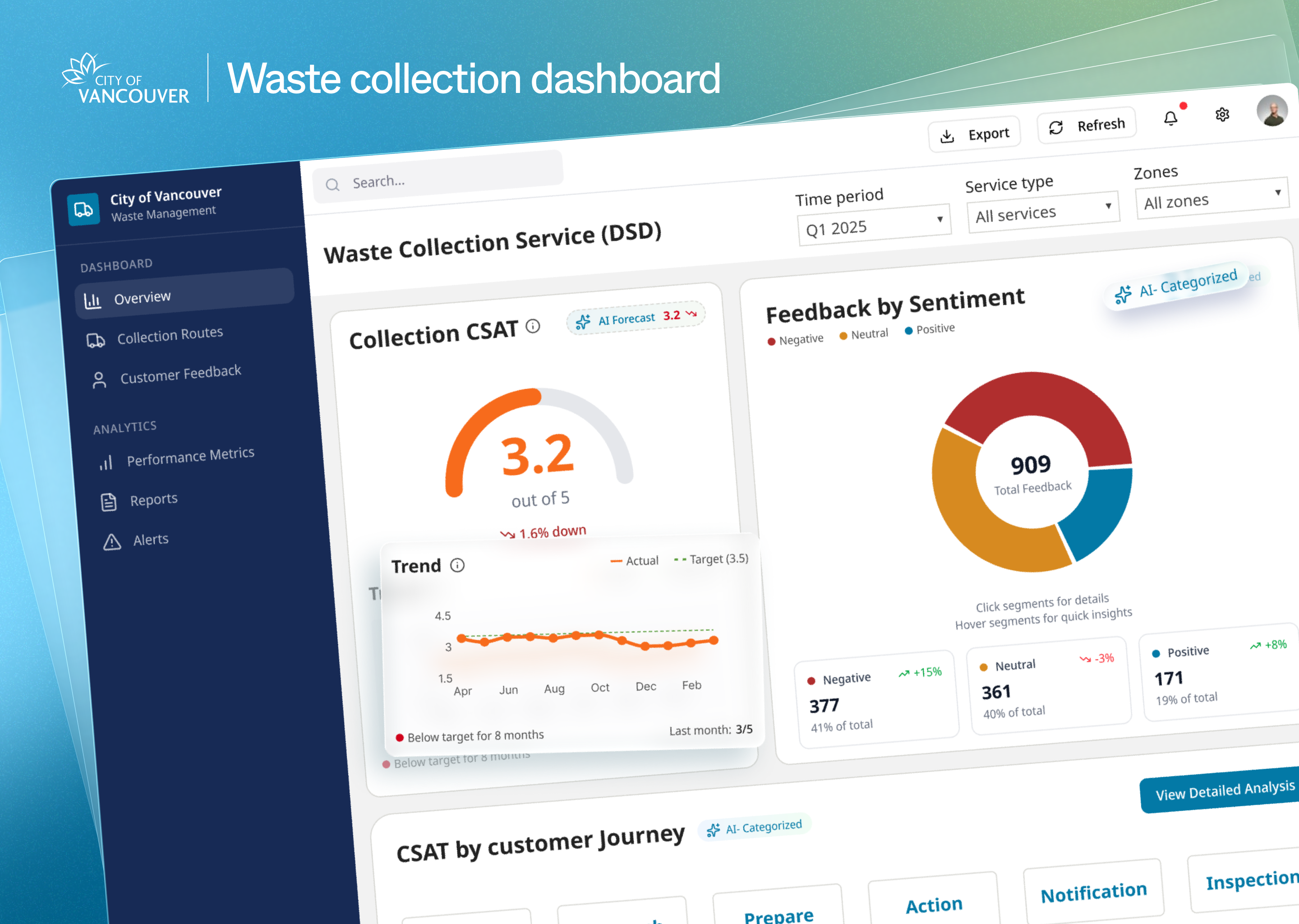
Vancouver’s Waste Collection perfermance dashboard for leadership
Leveraging UX research and AI-enhanced dashboards to streamline decision-making for leadership on waste collection service
UX Strategy
Service Design
AI
Power BI

Overview


Waste collection is one of the most essential public services
Every household in Vancouver, over 300,000+, interacts with this system
multiple times a week.
When collection fails, the effects are immediate overflowing bins, missed pickups, fustrated citizens and repeated complaints
Problems


Feedback was collected from various channels to ensure service quality
Vancouver residents were submitting complaints about waste collection through various channels—311 app, phone calls, and the city website.
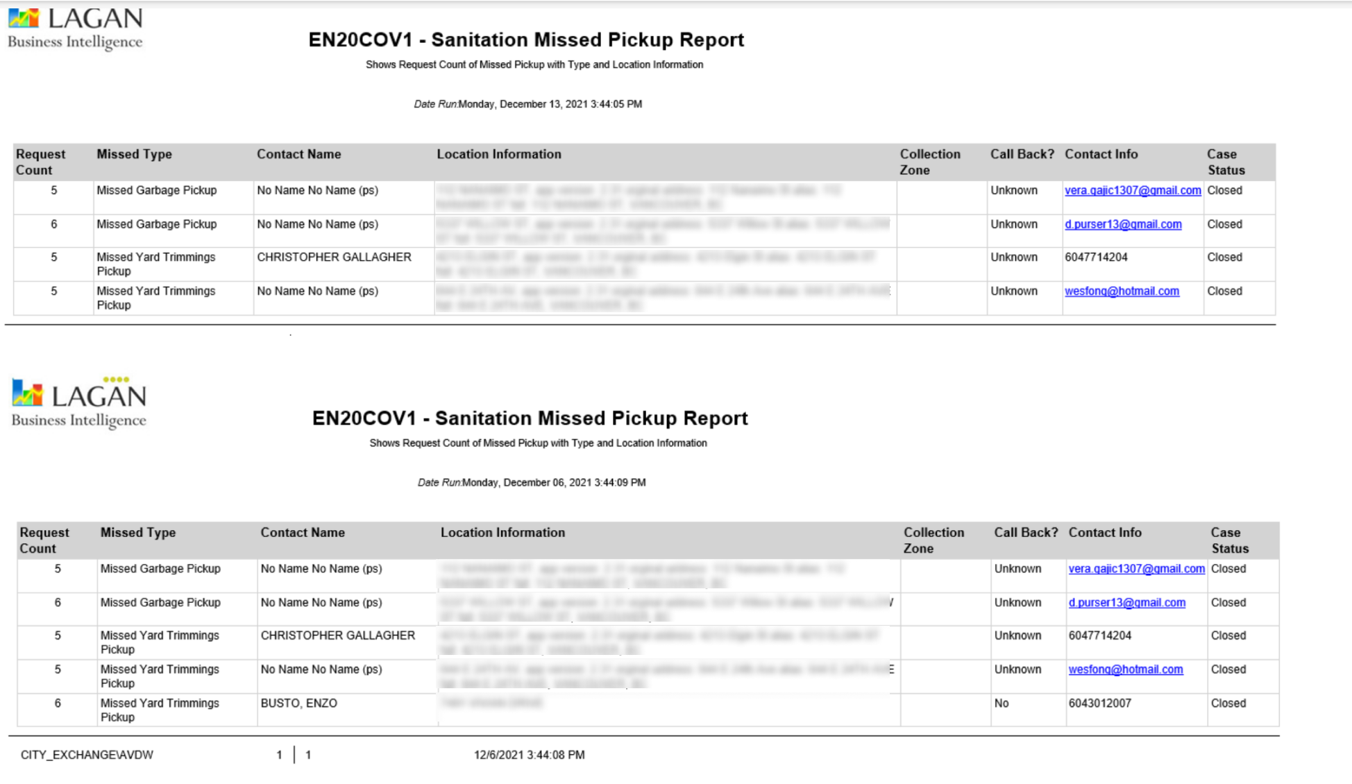
A list of daily updated feedback sent
by email
But, feedback without structure
= no action
How the feedback presetned was The city leadership has no a bird-eye view of waste collection service as a whole, so they don’t have visibility on where things were going wrong or who should act
Project goal
City leaders wanted to know where the issue occurred, user expectations, and who should act to assign issues correctly or improve services.
Visualize the waste collection service performance by journey stages through a centralized platform, enabling leaderships take quicker and more precise actions.
My role
- Lead UX Strategist
- Researcher / Facilitator
- Co-metric architect
What I did
- Rebuilt the waste collection user journey through 8 interviews
- Deliveried
- Facilitated co-design sessions with leadership
- Defined key metrics + data logic
- Designed a Power BI dashboard
- Partnered with AI team to classify feedback by journey step (80% accuracy)
Insights
Want to see how I came up with these insights?(angcher
Three key questions the dashboard needed to answer
Before designing the dashboard, I needed to make sure it would support real decision-making—not just display data. So I planned a workshop to align around one core question: What actions will directors and ops teams take—and can our data support those actions?”
1
How happy are customers with the service?
2
At what stages in the journey are customers dissatisfied or facing issues?
3
What are the key drivers for satisfaction / dissatisfaction - identify areas we need to invest?
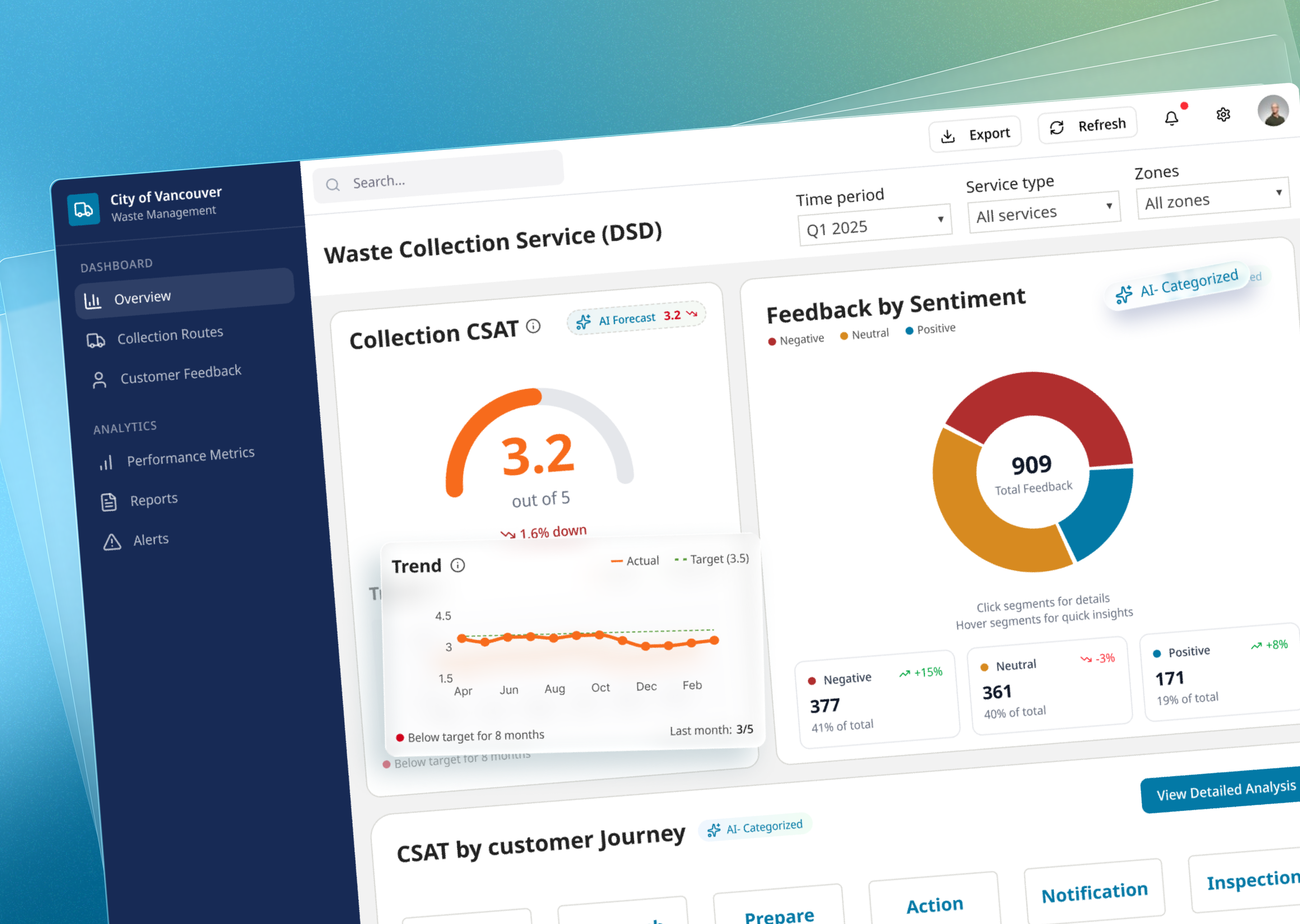
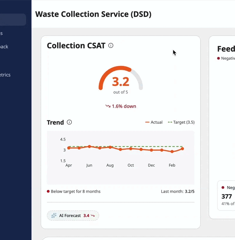
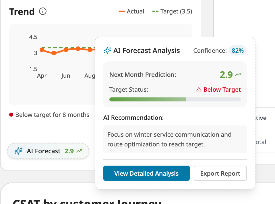
At a glance, leadership sees how satisfied citizens are — and how that’s changing over time. We defined a CSAT metric tailored to the waste collection journey by combining:
Trendlines highlight zones or weeks with sudden satisfaction drops — giving teams a proactive edge.
Design Solutions
- Customer Satisfaction Score (CSAT) with trend
At a glance, leadership sees how satisfied citizens are — and how that’s changing over time. We defined a CSAT metric tailored to the waste collection journey by combining:
Trendlines highlight zones or weeks with sudden satisfaction drops — giving teams a proactive edge.
SCAT = (Success Rate×0.4) + (Sentiment score×0.3) + (Avg. speed of answer×0.15)+ (Handle time×0.15)
At a glance, leadership sees how satisfied citizens are — and how that’s changing over time. We defined a CSAT metric tailored to the waste collection journey by combining:
Trendlines highlight zones or weeks with sudden satisfaction drops — giving teams a proactive edge.
At a glance, leadership sees how satisfied citizens are — and how that’s changing over time. We defined a CSAT metric tailored to the waste collection journey by combining:
Trendlines highlight zones or weeks with sudden satisfaction drops — giving teams a proactive edge.
- AI-Classified feedback by journey Step, sentiment and topic - 80% Accuracy
By its emotional tone (positive / neutral / negative)
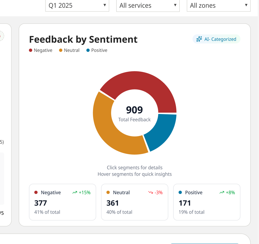
By journey step
Want to see how I came up with these insights?(angcher
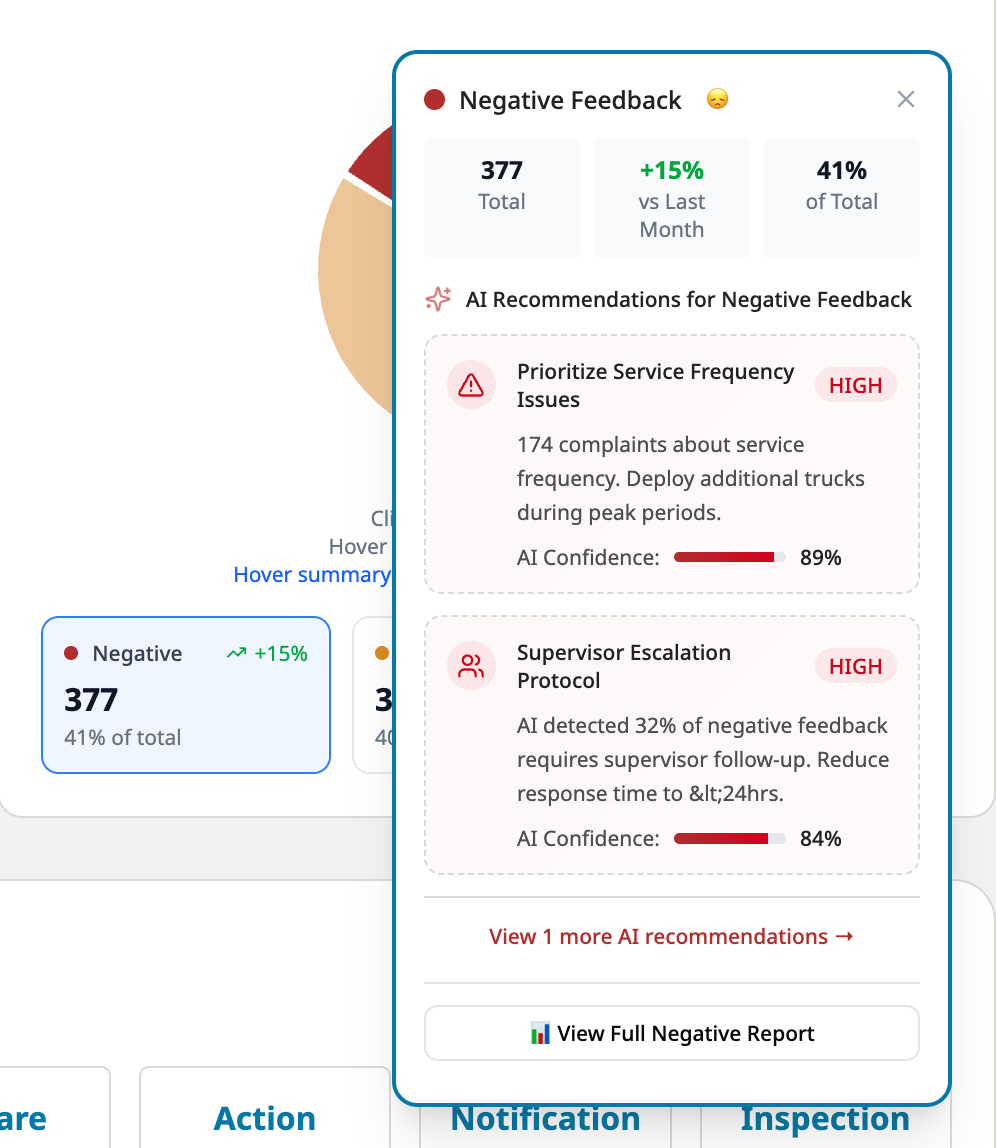
- AI-Driven recommendations for action
Every piece of feedback is automatically tagged by:
- where it occurred in the service journey,
- its emotional tone (positive / neutral / negative)
- Sepcific topics
This lets teams filter issues by specific breakdown points, not just generic topics — turning thousands of messages into structured insight with 80% accuracy.
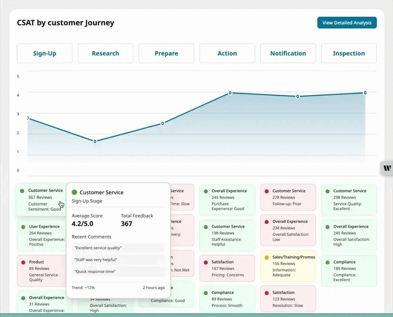
- Drill down pages as needed
Every piece of feedback is automatically tagged by:
- where it occurred in the service journey,
- its emotional tone (positive / neutral / negative)
- Sepcific topics
This lets teams filter issues by specific breakdown points, not just generic topics — turning thousands of messages into structured insight with 80% accuracy.
Highlight moment
When our AI prototype achieved 80% tagging accuracy across 1000+ citizen complaints,. "Now, teams use this dashboard weekly. They know exactly what the issues are, where they happen, and who needs to fix them."
📊
Power BI dashboard launched with journey-level feedback visibility
🤖
AI model achieved 80% accuracy in tagging unstructured feedback
⏱
Reduced decision-making time for leadership through clear visual prioritization
Reflection
What I learned:
What I learned:
- Data isn’t useful without structure
- AI is powerful—but needs UX to be usable
- Feedback systems must be designed end-to-end, not patched post hoc
What I’d do next: Integrate journey-based feedback capture into reporting tools like Van311
Bring me back to top
Vancouver’s Waste Collection perfermance dashboard for leadership
Leveraging UX research and AI-enhanced dashboards to streamline decision-making for leadership on waste collection service
UX Strategy
Service Design
AI
Power BI
Overview


Waste collection is one of the most essential public services
Every household in Vancouver, over 300,000+, interacts with this system multiple times a week.
When collection fails, the effects are immediate overflowing bins, missed pickups, fustrated citizens and repeated complaints
Problems


Feedback was collected from various channels to ensure service quality
Vancouver residents were submitting complaints about waste collection through various channels—311 app, phone calls, and the city website.
But, feedback without structure
= no action
How the feedback presetned was The city leadership has no a bird-eye view of waste collection service as a whole, so they don’t have visibility on where things were going wrong or who should act
A list of daily updated feedback sent by email
Project goal
City leaders wanted to know where the issue occurred, user expectations, and who should act to assign issues correctly or improve services.
Visualize the waste collection service performance by journey stages through a centralized platform, enabling leaderships take quicker and more precise actions.
My role
- Lead UX Strategist
- Researcher / Facilitator
- Co-metric architect
What I did
- Rebuilt the waste collection user journey through 8 interviews
- Deliveried
- Facilitated co-design sessions with leadership
- Defined key metrics + data logic
- Designed a Power BI dashboard
- Partnered with AI team to classify feedback by journey step (80% accuracy)
Insights
Want to see how I came up with these insights?(angcher
Three key questions the dashboard needed to answer
Before designing the dashboard, I needed to make sure it would support real decision-making—not just display data. So I planned a workshop to align around one core question: What actions will directors and ops teams take—and can our data support those actions?”
1
How happy are customers with the service?
2
At what stages in the journey are customers dissatisfied or facing issues?
3
What are the key drivers for satisfaction / dissatisfaction - identify areas we need to invest?
At a glance, leadership sees how satisfied citizens are — and how that’s changing over time. We defined a CSAT metric tailored to the waste collection journey by combining:
Trendlines highlight zones or weeks with sudden satisfaction drops — giving teams a proactive edge.
Design Solutions
- Customer Satisfaction Score (CSAT) with trend
At a glance, leadership sees how satisfied citizens are — and how that’s changing over time. We defined a CSAT metric tailored to the waste collection journey by combining:
Trendlines highlight zones or weeks with sudden satisfaction drops — giving teams a proactive edge.
SCAT = (Success Rate×0.4) + (Sentiment score×0.3) + (Avg. speed of answer×0.15)+ (Handle time×0.15)
At a glance, leadership sees how satisfied citizens are — and how that’s changing over time. We defined a CSAT metric tailored to the waste collection journey by combining:
Trendlines highlight zones or weeks with sudden satisfaction drops — giving teams a proactive edge.
At a glance, leadership sees how satisfied citizens are — and how that’s changing over time. We defined a CSAT metric tailored to the waste collection journey by combining:
Trendlines highlight zones or weeks with sudden satisfaction drops — giving teams a proactive edge.
- AI-Classified feedback by journey Step, sentiment and topic - 80% Accuracy
By its emotional tone (positive / neutral / negative)
By journey step
Want to see how I came up with these insights?(angcher
- AI-Driven recommendations for action
Every piece of feedback is automatically tagged by:
- where it occurred in the service journey,
- its emotional tone (positive / neutral / negative)
- Sepcific topics
This lets teams filter issues by specific breakdown points, not just generic topics — turning thousands of messages into structured insight with 80% accuracy.
- Drill down pages as needed
Every piece of feedback is automatically tagged by:
- where it occurred in the service journey,
- its emotional tone (positive / neutral / negative)
- Sepcific topics
This lets teams filter issues by specific breakdown points, not just generic topics — turning thousands of messages into structured insight with 80% accuracy.
Highlight moment
When our AI prototype achieved 80% tagging accuracy across 1000+ citizen complaints,. "Now, teams use this dashboard weekly. They know exactly what the issues are, where they happen, and who needs to fix them."
📊
Power BI dashboard launched with journey-level feedback visibility
🤖
AI model achieved 80% accuracy in tagging unstructured feedback
⏱
Reduced decision-making time for leadership through clear visual prioritization
Reflection
What I learned:
What I learned:
- Data isn’t useful without structure
- AI is powerful—but needs UX to be usable
- Feedback systems must be designed end-to-end, not patched post hoc
What I’d do next: Integrate journey-based feedback capture into reporting tools like Van311
Bring me back to top
Vancouver’s waste collection performance dashboard for the city leadership
UX Strategy
Service Design
AI
Power BI
Transforming unstructured public feedback into structured, actionable insights through UX strategy and data visualization
Overview


Waste collection is one of the most
essential public services
Every household in Vancouver, over 300,000+, interacts with this system
multiple times a week.
When collection fails, the effects are immediate such as, overflowing bins, missed pickups, frustrated citizens and repeated complaints.
Problems


Feedback was collected from various channels to ensure service quality
Vancouver residents were submitting complaints about waste collection through various channels—311 app, phone calls, and the city website.
But, feedback without structure
= no action
How the feedback presented was just a list of daily updated feedback sent by email. The city leadership has no a bird-eye view of waste collection service as a whole, so they don’t have visibility on where things were going wrong or who should act.
A list of daily updated feedback sent by email
Project goal
City leaders wanted to know where the issue occurred, user expectations, and who should act to assign issues correctly or improve services.
Visualize the waste collection service performance by journey stages through a centralized platform, enabling leaderships take quicker and more precise actions.
My role
- Lead UX Strategist
- Researcher / Facilitator
- Co-metric architect
What I did
- Rebuilt the waste collection user journey through 8 interviews
- Delivered a waste collection
- Facilitated co-design sessions with leadership
- Defined key metrics + data logic
- Designed a Power BI dashboard
- Partnered with AI team to classify feedback by journey step (80% accuracy)
Insights
Want to see how I came up with these insights?(Coming soon)
Three key questions the dashboard needed to answer
Before designing the dashboard, I needed to make sure it would support real decision-making—not just display data. So I planned a workshop to align around one core question: What actions will directors and ops teams take—and can our data support those actions?”
1
How happy are customers with the service?
2
At what stages in the journey are customers dissatisfied or facing issues?
3
What are the key drivers for satisfaction / dissatisfaction?
Disclaimer: This design is recreated in Figma Make for data privacy. The original was made in PowerBI.
Design Solutions
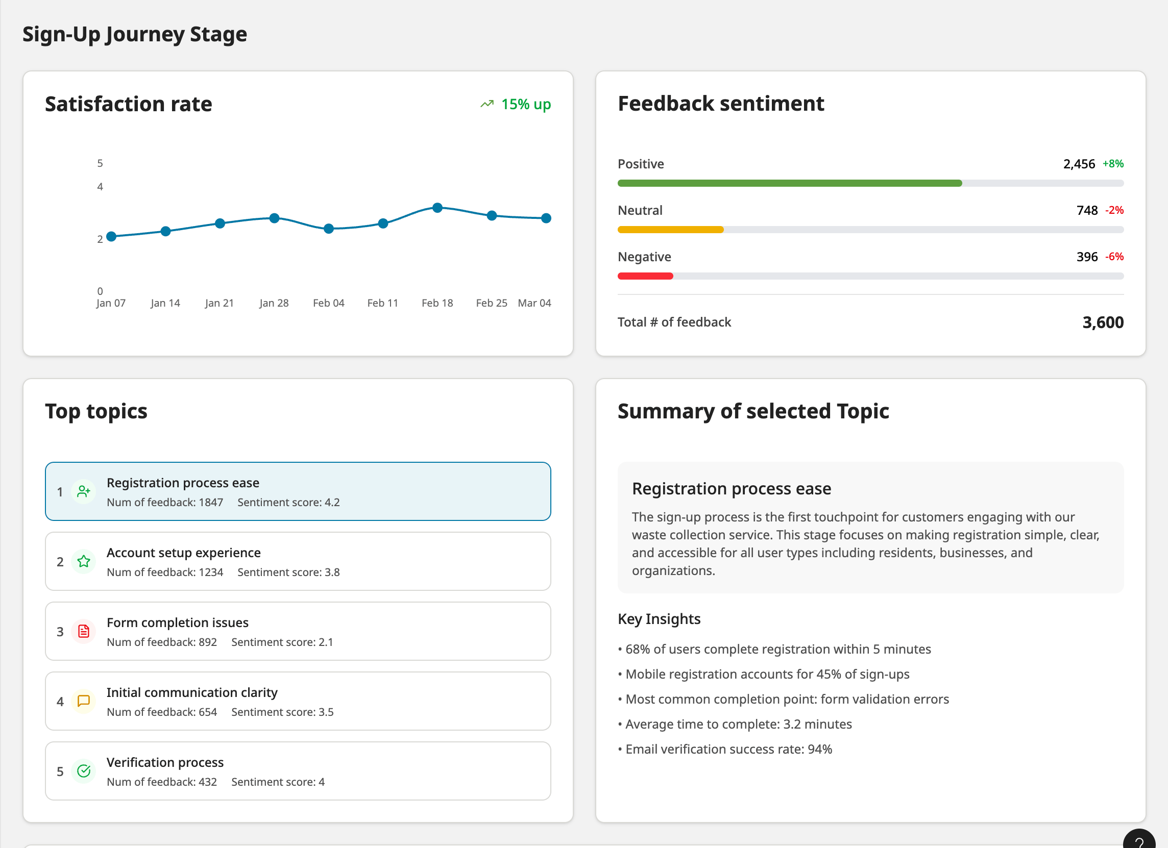
- Customer Satisfaction Score (CSAT) with trend
Leadership sees citizen satisfaction and its changes over time. We defined a CSAT metric for the waste collection journey by combining:
SCAT = (Success Rate×0.4) + (Sentiment score×0.3) + (Avg. speed of answer×0.15)+ (Handle time×0.15)
- Trendlines show satisfaction drops, giving teams an edge.
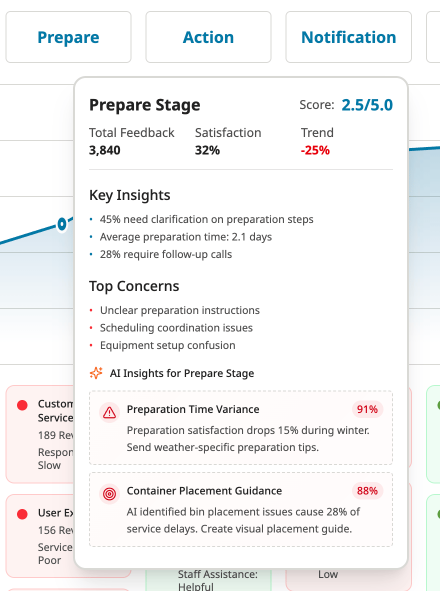
- AI Forecast predicts how it will change and suggests actions based on recurring patterns.
- AI-Classified feedback by journey Step, sentiment and topic - 80% Accuracy
By its emotional tone (positive / neutral / negative)
By journey step
See how this journey map is defined (Coming soon)
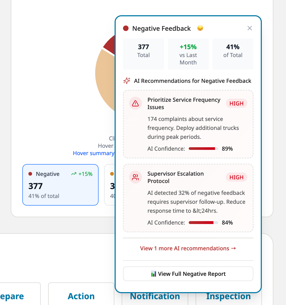
- AI-Driven recommendations for action
Rather than just showing what’s wrong, the dashboard proactively suggests what to do next.The AI scans trends in feedback volume, sentiment, and journey stage classification to generate targeted, contextual recommendations.
- Drill down pages as needed
This feature allows leadership and operations teams to zoom into a specific stage of the service journey and understand what’s working, what’s not, and actionable Topic-Level Insights.
Highlight moment
When our AI prototype achieved 80% tagging accuracy across 1000+ citizen complaints,. "Now, teams use this dashboard weekly. They know exactly what the issues are, where they happen, and who needs to fix them."
📊
Power BI dashboard launched with journey-level feedback visibility
🤖
AI model achieved 80% accuracy in tagging unstructured feedback
⏱
Reduced decision-making time for leadership through clear visual prioritization
Reflection
What I learned about designing data product
- Data isn’t useful without structure
- AI is powerful—but needs UX to be usable
- Feedback systems must be designed end-to-end, not patched post hoc
Bring me back to top